Content development & wireframing
Initially, I thought my responsibilities would include user research and interaction design...in reality, I needed to create and write the instructional content for the product first.
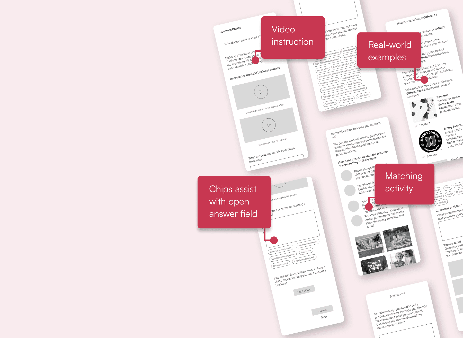
Once I’d researched and written the learning material for the first module, I began wireframing based on my user flows.

I explored solutions for the dashboard, then broke down the learning module I had wireframed into smaller parts to keep the learning activities short and the reward (completion) cycle high. Based on the interview described above, I designed the flow in many short screens so that no scrolling would be required of the user.
Dashboard iterations


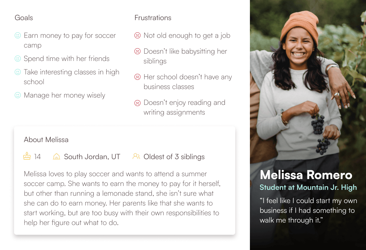
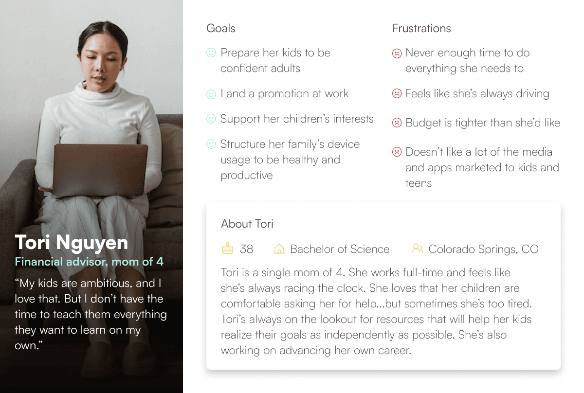
When I was recruited for this project, the founder had already conducted a number of interviews among our target audience. Based on her learnings, I developed personas to illustrate the two user groups for whom I’m designing this product. I updated them after conducting adaptive interviews and surveys.
User personas

Why I joined this project
Many teens and tweens want to become entrepreneurs and start earning money - including my own kids. I’m excited to shape a greenfield product that will guide young people to business ownership in a fun and understandable fashion.
Where
Utah County, Utah
Native Mobile App (Android)
What
Freelance project for founder
0 to 1 product design
Why
Role
Designer, Researcher, Writer
EdTech, Startups, Kids & Teens
Category:
Jan 2023 - Present
When

Making Cents Mobile App
An interactive learning product for young entrepreneurs
User Flows
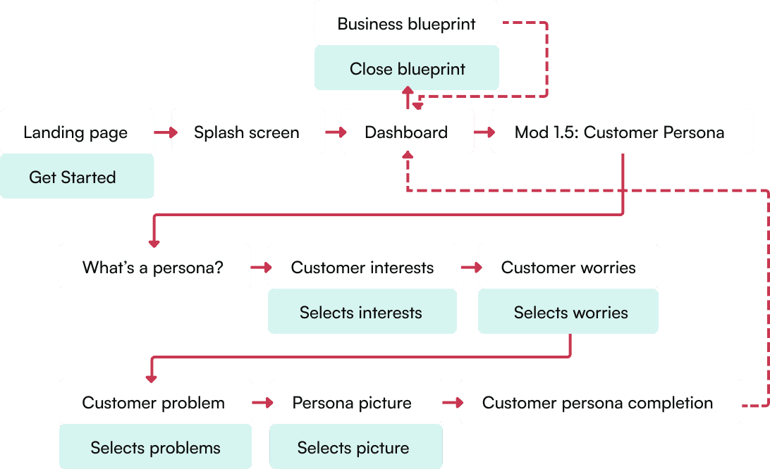
My initial user flows mapped the structure of the app and the entirety of the first lesson (learning module). To build a prototype that would take users approximately 5 minutes to complete, I pulled a small portion of this flow to prototype first. It’s one of those “bite-sized” learning units within Module 1.
Interviewing an industry leader
Key insights to implement
While I was creating the content and wireframes I had the opportunity to meet with the general manager of a leading edtech product within the mobile app market. I decided to experiment with the Making Cents prototype based on some key takeaways from our conversation.
User research
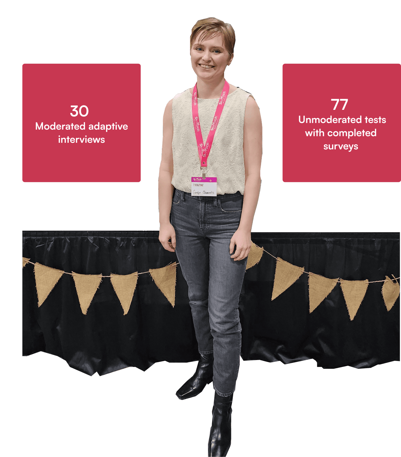
Because I didn’t know exactly what to expect from the participants or the environment at the conference, I prepared 2 different research methods to ensure I collected the right data to meet my client’s objectives: an adaptive interview guide and a user exit survey to be used in conjunction with the prototype I prepared. In addition, I made usability observations as I interviewed participants and watched their interactions with the prototype.
Research findings
Usability observations
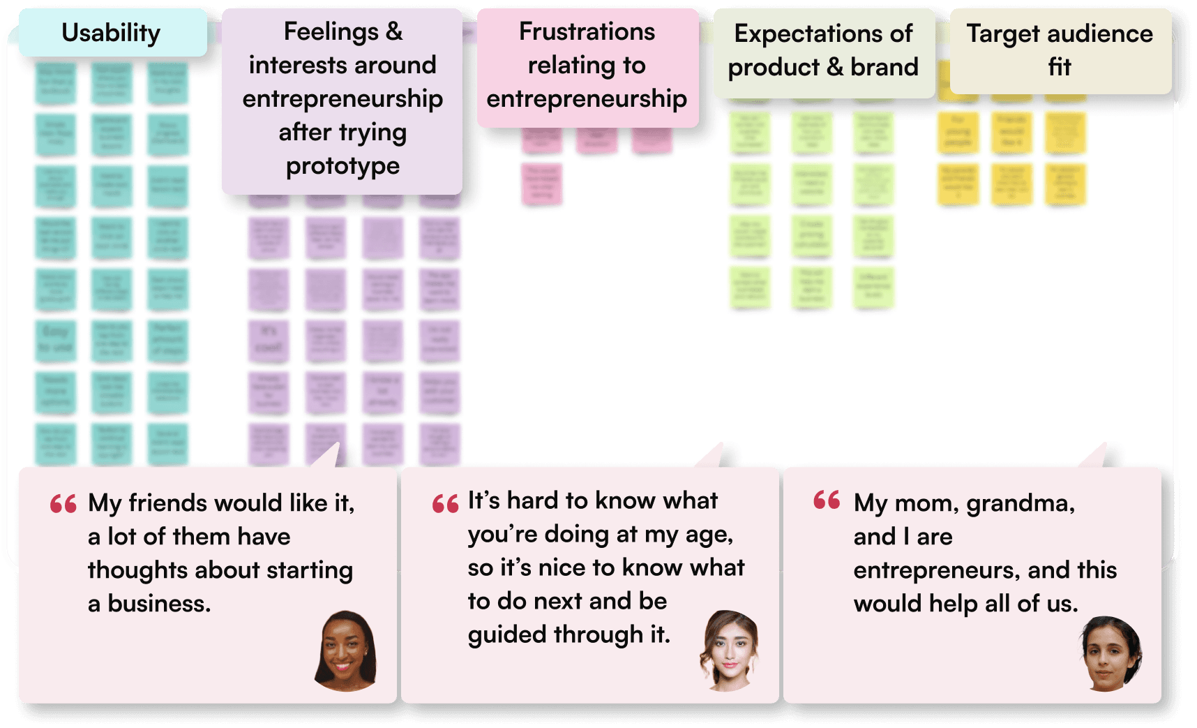
Most users reported that the biggest reason they hadn’t pursued entrepreneurship was uncertainty about what steps to take or what to do next.
The dashboard was confusing to most users, mainly because of redundant buttons. I have removed the redundant buttons accordingly and will explore other solutions for the dashboard interface.
Users felt that entrepreneurship would be more attainable for them after trying the prototype.
Some users didn't want to read even small amounts of text. Recommendation: Explore other modes of information delivery.
Users felt increased excitement and interest around starting a business after trying the prototype.
To make sure my designs served my users needs in a different way from existing offerings, I took a look at some platforms that also aim to serve young . Good news: as far as I can tell, there are currently no products available that educate and support kids with the independence and interactivity that Making Cents will offer.
Competitive analysis
Competitor strengths
Competitors offer strong lessons in entrepreneurship, and some come with pre-built platforms and items that kids can sell, offering quick gratification.
Competitor Weaknesses
Competitors’ educational materials are composed almost entirely of reading and writing activities and do not include interactive features to support engaging and varied learning. None of them offer a full mobile app experience that would guide teen entrepreneurs step-by-step.

No-scrolling policy
Use constraints to make open responses easier
Make action so obvious they don’t have to read
Make activities scalable
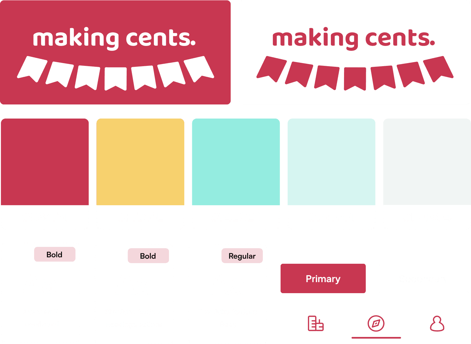
UI branding and definitions
The branding for this product is in a state of flux.
But to draw participants at the conference and make the prototype feel “real” I designed an image for the brand and some interface styles.
To start, I collected inspiration feature iconic symbols that many Americans associate with young entrepreneurs.

Prototyping
My client (product founder) had arranged a unique opportunity for user research at a state-wide STEM conference for teen girls.
Her request was that I prepare an MVP prototype for the girls to interact with and gather information.
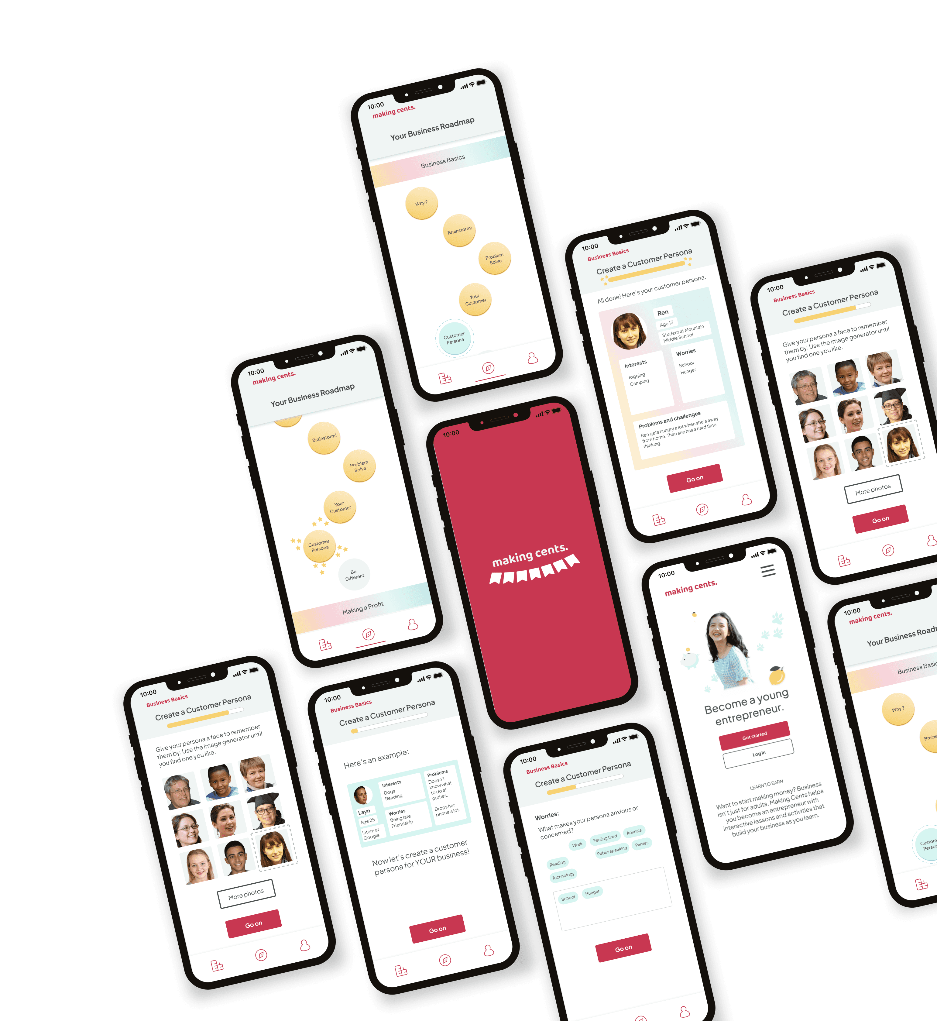
To promote meaningful feedback, I designed the prototype in mid-fidelity, introducing basic colors and images.
I successfully created an interactive MVP prototype for my client's deadline, a user research opportunity at a local conference. With the data garnered, I will be iterating on the dashboard of the app, writing and designing additional instructional material, and designing scalable learning activities that meet users' needs based on initial and ongoing research.
Up Next
Where
Utah County, Utah
Native Mobile App (Android)
What
Freelance project for founder
0 to 1 product design
Why
Role
Designer, Researcher, Writer
EdTech, Startups, Kids & Teens
Category:
Jan 2023 - Present
When
Making Cents Mobile App
An interactive learning product for young entrepreneurs

Why I joined this project
Many teens and tweens want to become entrepreneurs and start earning money - including my own kids. I’m excited to shape a greenfield product that will guide young people to business ownership in a fun and understandable fashion.
Competitive analysis
To make sure my designs served my users needs in a different way from existing offerings, I took a look at some platforms that also aim to serve young . Good news: as far as I can tell, there are currently no products available that educate and support kids with the independence and interactivity that Making Cents will offer.


Competitor strengths
Competitors offer strong lessons in entrepreneurship, and some come with pre-built platforms and items that kids can sell, offering quick gratification.
Competitor Weaknesses
Competitors’ educational materials are composed almost entirely of reading and writing activities and do not include interactive features to support engaging and varied learning. None of them offer a full mobile app experience that would guide teen entrepreneurs step-by-step.
User personas
When I was recruited for this project, the founder had already conducted a number of interviews among our target audience. Based on her learnings, I developed personas to illustrate the two user groups for whom I’m designing this product. I updated them after conducting adaptive interviews and surveys.


Content development & wireframing
Initially, I thought my responsibilities would include user research and interaction design...in reality, I needed to create and write the instructional content for the product first.
Once I’d researched and written the learning material for the first module, I began wireframing based on my user flows.
Interviewing an industry leader
While I was creating the content and wireframes I had the opportunity to meet with the general manager of a leading edtech product within the mobile app market. I decided to experiment with the Making Cents prototype based on some key takeaways from our conversation.
Key insights to implement
No-scrolling policy
Use constraints to make open responses easier
Make action so obvious they don’t have to read
Make activities scalable
User Flows
My initial user flows mapped the structure of the app and the entirety of the first lesson (learning module). To build a prototype that would take users approximately 5 minutes to complete, I pulled a small portion of this flow to prototype first. It’s one of those “bite-sized” learning units within Module 1.


Prototyping
My client (product founder) had arranged a unique opportunity for user research at a state-wide STEM conference for teen girls.
Her request was that I prepare an MVP prototype for the girls to interact with and gather information.
To promote meaningful feedback, I designed the prototype in mid-fidelity, introducing basic colors and images.

User research
Because I didn’t know exactly what to expect from the participants or the environment at the conference, I prepared 2 different research methods to ensure I collected the right data to meet my client’s objectives: an adaptive interview guide and a user exit survey to be used in conjunction with the prototype I prepared. In addition, I made usability observations as I interviewed participants and watched their interactions with the prototype.

Research findings
Most users reported that the biggest reason they hadn’t pursued entrepreneurship was uncertainty about what steps to take or what to do next.
Users felt that entrepreneurship would be more attainable for them after trying the prototype.
Users felt increased excitement and interest around starting a business after trying the prototype.

Usability observations
The dashboard was confusing to most users, mainly because of redundant buttons. I have removed the redundant buttons accordingly and will explore other solutions for the dashboard interface.
Some users didn't want to read even small amounts of text. Recommendation: Explore other modes of information delivery.
Up Next
I successfully created an interactive MVP prototype for my client's deadline, a user research opportunity at a local conference. With the data garnered, I will be iterating on the dashboard of the app, writing and designing additional instructional material, and designing scalable learning activities that meet users' needs based on initial and ongoing research.
UI branding and definitions
The branding for this product is in a state of flux.
But to draw participants at the conference and make the prototype feel “real” I designed an image for the brand and some interface styles.
To start, I collected inspiration feature iconic symbols that many Americans associate with young entrepreneurs.


Content development & wireframing
Initially, I thought my responsibilities would include user research and interaction design...in reality, I needed to create and write the instructional content for the product first.
Once I’d researched and written the learning material for the first module, I began wireframing based on my user flows.

I explored solutions for the dashboard, then broke down the learning module I had wireframed into smaller parts to keep the learning activities short and the reward (completion) cycle high. Based on the interview described above, I designed the flow in many short screens so that no scrolling would be required of the user.
Dashboard iterations


When I was recruited for this project, the founder had already conducted a number of interviews among our target audience. Based on her learnings, I developed personas to illustrate the two user groups for whom I’m designing this product. I updated them after conducting adaptive interviews and surveys.
User personas

Why I joined this project
Many teens and tweens want to become entrepreneurs and start earning money - including my own kids. I’m excited to shape a greenfield product that will guide young people to business ownership in a fun and understandable fashion.
Where
Utah County, Utah
Native Mobile App (Android)
What
Freelance project for founder
0 to 1 product design
Why
Role
Designer, Researcher, Writer
EdTech, Startups, Kids & Teens
Category:
Jan 2023 - Present
When

Making Cents Mobile App
An interactive learning product for young entrepreneurs

User Flows
My initial user flows mapped the structure of the app and the entirety of the first lesson (learning module). To build a prototype that would take users approximately 5 minutes to complete, I pulled a small portion of this flow to prototype first. It’s one of those “bite-sized” learning units within Module 1.
Interviewing an industry leader
Key insights to implement
While I was creating the content and wireframes I had the opportunity to meet with the general manager of a leading edtech product within the mobile app market. I decided to experiment with the Making Cents prototype based on some key takeaways from our conversation.
User research
Because I didn’t know exactly what to expect from the participants or the environment at the conference, I prepared 2 different research methods to ensure I collected the right data to meet my client’s objectives: an adaptive interview guide and a user exit survey to be used in conjunction with the prototype I prepared. In addition, I made usability observations as I interviewed participants and watched their interactions with the prototype.
Research findings
Usability observations
Most users reported that the biggest reason they hadn’t pursued entrepreneurship was uncertainty about what steps to take or what to do next.
The dashboard was confusing to most users, mainly because of redundant buttons. I have removed the redundant buttons accordingly and will explore other solutions for the dashboard interface.
Users felt that entrepreneurship would be more attainable for them after trying the prototype.
Some users didn't want to read even small amounts of text. Recommendation: Explore other modes of information delivery.
Users felt increased excitement and interest around starting a business after trying the prototype.
To make sure my designs served my users needs in a different way from existing offerings, I took a look at some platforms that also aim to serve young . Good news: as far as I can tell, there are currently no products available that educate and support kids with the independence and interactivity that Making Cents will offer.
Competitive analysis
Competitor strengths
Competitors offer strong lessons in entrepreneurship, and some come with pre-built platforms and items that kids can sell, offering quick gratification.
Competitor Weaknesses
Competitors’ educational materials are composed almost entirely of reading and writing activities and do not include interactive features to support engaging and varied learning. None of them offer a full mobile app experience that would guide teen entrepreneurs step-by-step.


No-scrolling policy
Use constraints to make open responses easier
Make action so obvious they don’t have to read
Make activities scalable
UI branding and definitions
The branding for this product is in a state of flux.
But to draw participants at the conference and make the prototype feel “real” I designed an image for the brand and some interface styles.
To start, I collected inspiration feature iconic symbols that many Americans associate with young entrepreneurs.

Prototyping
My client (product founder) had arranged a unique opportunity for user research at a state-wide STEM conference for teen girls.
Her request was that I prepare an MVP prototype for the girls to interact with and gather information.
To promote meaningful feedback, I designed the prototype in mid-fidelity, introducing basic colors and images.
I successfully created an interactive MVP prototype for my client's deadline, a user research opportunity at a local conference. With the data garnered, I will be iterating on the dashboard of the app, writing and designing additional instructional material, and designing scalable learning activities that meet users' needs based on initial and ongoing research.
Up Next
Where
Utah County, Utah
Native Mobile App (Android)
What
Freelance project for founder
0 to 1 product design
Why
Role
Designer, Researcher, Writer
EdTech, Startups, Kids & Teens
Category:
Jan 2023 - Present
When
Making Cents Mobile App
An interactive learning product for young entrepreneurs

Why I joined this project
Many teens and tweens want to become entrepreneurs and start earning money - including my own kids. I’m excited to shape a greenfield product that will guide young people to business ownership in a fun and understandable fashion.
Competitive analysis
To make sure my designs served my users needs in a different way from existing offerings, I took a look at some platforms that also aim to serve young . Good news: as far as I can tell, there are currently no products available that educate and support kids with the independence and interactivity that Making Cents will offer.


Competitor strengths
Competitors offer strong lessons in entrepreneurship, and some come with pre-built platforms and items that kids can sell, offering quick gratification.
Competitor Weaknesses
Competitors’ educational materials are composed almost entirely of reading and writing activities and do not include interactive features to support engaging and varied learning. None of them offer a full mobile app experience that would guide teen entrepreneurs step-by-step.
User personas
When I was recruited for this project, the founder had already conducted a number of interviews among our target audience. Based on her learnings, I developed personas to illustrate the two user groups for whom I’m designing this product. I updated them after conducting adaptive interviews and surveys.


Content development & wireframing
Initially, I thought my responsibilities would include user research and interaction design...in reality, I needed to create and write the instructional content for the product first.
Once I’d researched and written the learning material for the first module, I began wireframing based on my user flows.
Interviewing an industry leader
While I was creating the content and wireframes I had the opportunity to meet with the general manager of a leading edtech product within the mobile app market. I decided to experiment with the Making Cents prototype based on some key takeaways from our conversation.
Key insights to implement
No-scrolling policy
Use constraints to make open responses easier
Make action so obvious they don’t have to read
Make activities scalable
User Flows
My initial user flows mapped the structure of the app and the entirety of the first lesson (learning module). To build a prototype that would take users approximately 5 minutes to complete, I pulled a small portion of this flow to prototype first. It’s one of those “bite-sized” learning units within Module 1.


Prototyping
My client (product founder) had arranged a unique opportunity for user research at a state-wide STEM conference for teen girls.
Her request was that I prepare an MVP prototype for the girls to interact with and gather information.
To promote meaningful feedback, I designed the prototype in mid-fidelity, introducing basic colors and images.

User research
Because I didn’t know exactly what to expect from the participants or the environment at the conference, I prepared 2 different research methods to ensure I collected the right data to meet my client’s objectives: an adaptive interview guide and a user exit survey to be used in conjunction with the prototype I prepared. In addition, I made usability observations as I interviewed participants and watched their interactions with the prototype.

Research findings
Most users reported that the biggest reason they hadn’t pursued entrepreneurship was uncertainty about what steps to take or what to do next.
Users felt that entrepreneurship would be more attainable for them after trying the prototype.
Users felt increased excitement and interest around starting a business after trying the prototype.

Usability observations
The dashboard was confusing to most users, mainly because of redundant buttons. I have removed the redundant buttons accordingly and will explore other solutions for the dashboard interface.
Some users didn't want to read even small amounts of text. Recommendation: Explore other modes of information delivery.
Up Next
I successfully created an interactive MVP prototype for my client's deadline, a user research opportunity at a local conference. With the data garnered, I will be iterating on the dashboard of the app, writing and designing additional instructional material, and designing scalable learning activities that meet users' needs based on initial and ongoing research.
UI branding and definitions
The branding for this product is in a state of flux.
But to draw participants at the conference and make the prototype feel “real” I designed an image for the brand and some interface styles.
To start, I collected inspiration feature iconic symbols that many Americans associate with young entrepreneurs.
