Kingdom Causes Bellflower

A website redesign for a Los Angeles community resource center

Where

Utah County, Utah

Website redesign

What

Freelance project for nonprofit

Why

Role

Designer, Copywriter

Nonprofits, community

Category:

Aug 2022 - Oct 2022

When

Where

Utah County, Utah

Website redesign

What

Freelance project for nonprofit

Why

Role

Designer, Copywriter

Nonprofits, community

Category:

Aug 2022 - Oct 2022

When

Why I joined this project

What they needed

Storytelling that builds trust

Increased donations & volunteers

Online intake form

Improved website accessibility

In regards to our work, our donors don’t usually know the ins and outs of what we do. They can give us somewhat of an answer...but it’s usually a very general response, like ‘KCB works with the homeless’.


Caitlin G, KCBellflower

In regards to our work, our donors don’t usually know the ins and outs of what we do. They can give us somewhat of an answer...but it’s usually a very general response, like ‘KCB works with the homeless’.


-Caitlin G, KCBellflower

User research

From KCBellflower’s data

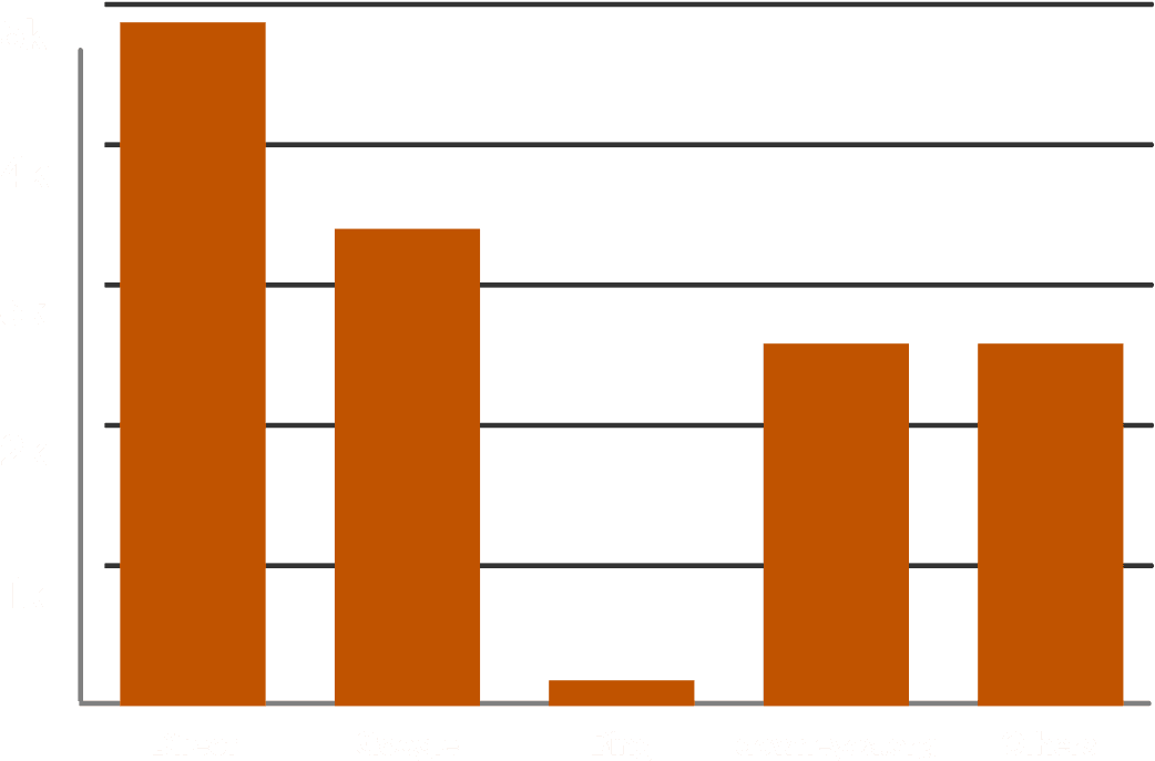
Top traffic sources

Top traffic sources

What items do you need? How can I help?

Requests for housing assistance (requiring printed paperwork)

1k

2k

3k

4k

5k

Direct

Google

Bing

downeyca.org

Others

Top time-draws for service representatives:

Exerpts from my user interview guide:

Research question: Discover the process that leads someone to give to a nonprofit organization and the role of the nonprofit’s web presence in that progression.

Objective 1: Understand what motivates a person to volunteer or donate.

Objective 2: Discover the reasons someone would choose to donate or volunteer to one nonprofit over another.

Objective 3: Learn what prompts trust in a nonprofit organization when visiting their website.

9

Users

Interviewed

9

Users

Interviewed

User interviews

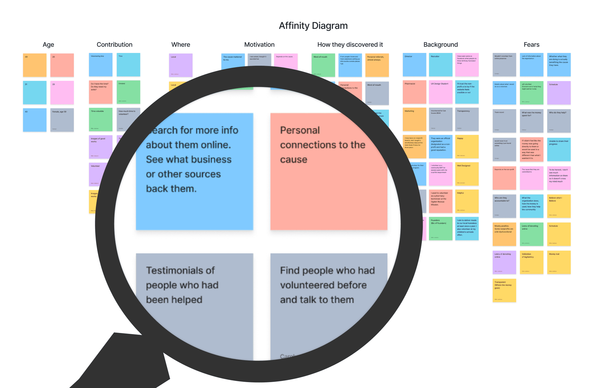
Because I didn’t have access to KCB’s clients or donors, I relied on directly applicable data I collected from 9 user interviews I conducted with a team on a previous project with very similar goals and users.

Top insights:

  • Users wanted assurance that the organization is deserving and reputable

  • They look for testimonials and first-hand experiences

  • Financial transparency is a top concern

  • They want to know their contribution affects real people

User persona

Based on KCB’s existing data, this persona represents most of their recurring donors.

Age 50+

Local, or were local

White

Christian

Word of mouth referral

Website is not first touchpoint

Makes most donations through website

Competitor analysis

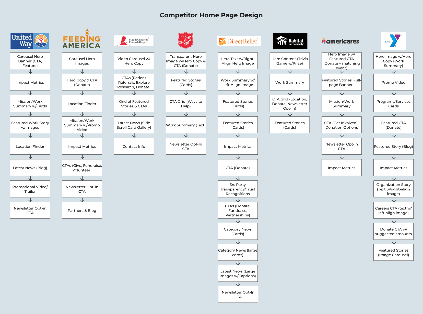
According to Forbes, these are the top 7 most successful charities in the United States based on fundraising and donor commitment (a key success metric for KCB). I dissected each of their landing pages into content components to understand how each landing page supports the goals of the organization.

Website audit

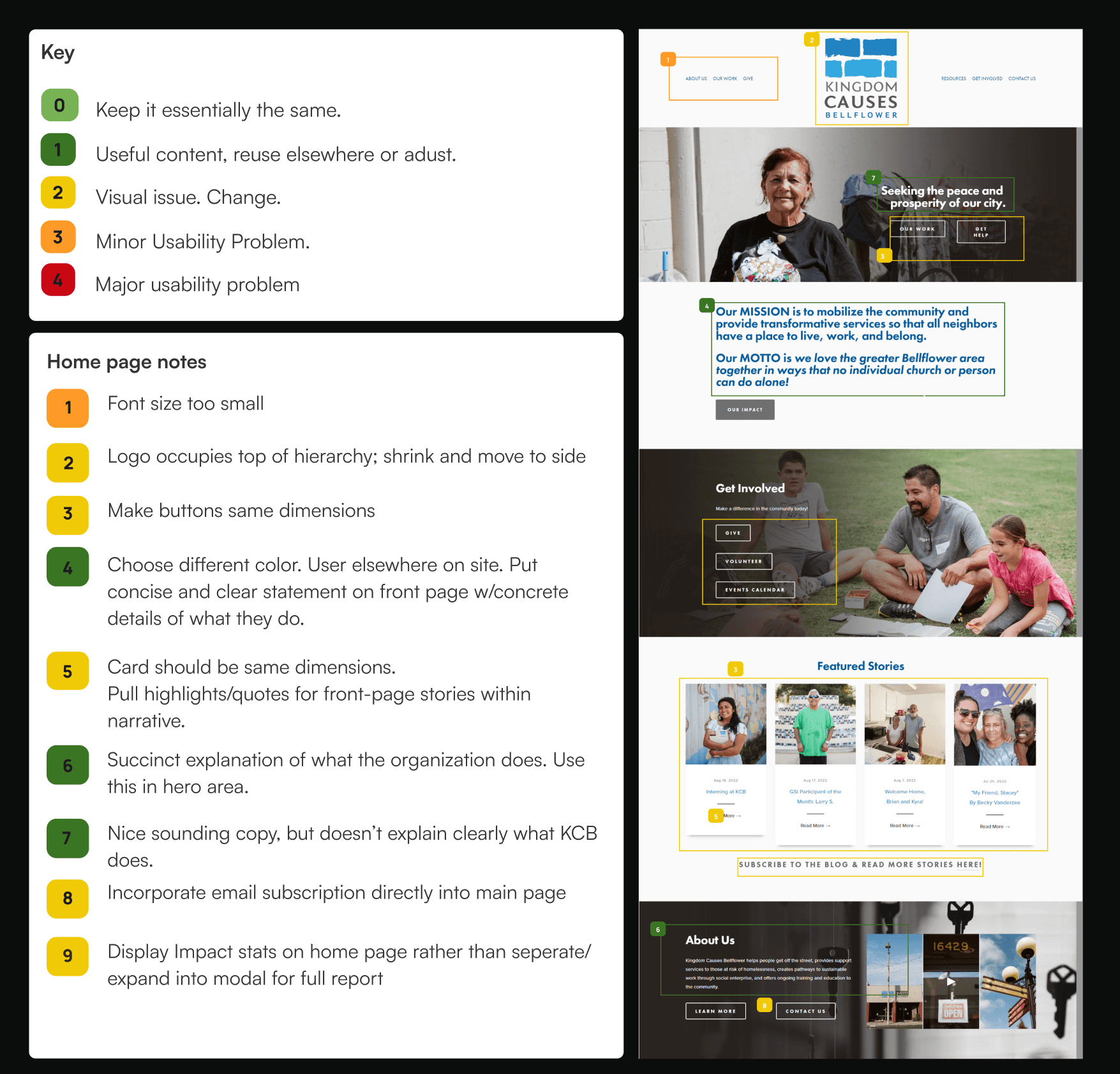
I constructed a wireflow of KCB’s website outlining their content structure and pinpointing issues.

I redlined the primary pages to highlight:


  • Heuristics and usability problems


  • Visual distractions


  • Portions of copy that were especially effective or ineffective


  • Elements to scrap, adapt, or move

  • I redlined the primary pages to highlight:


  • Heuristics and usability problems


  • Visual distractions


  • Portions of copy that were especially effective or ineffective


  • Elements to scrap, adapt, or move

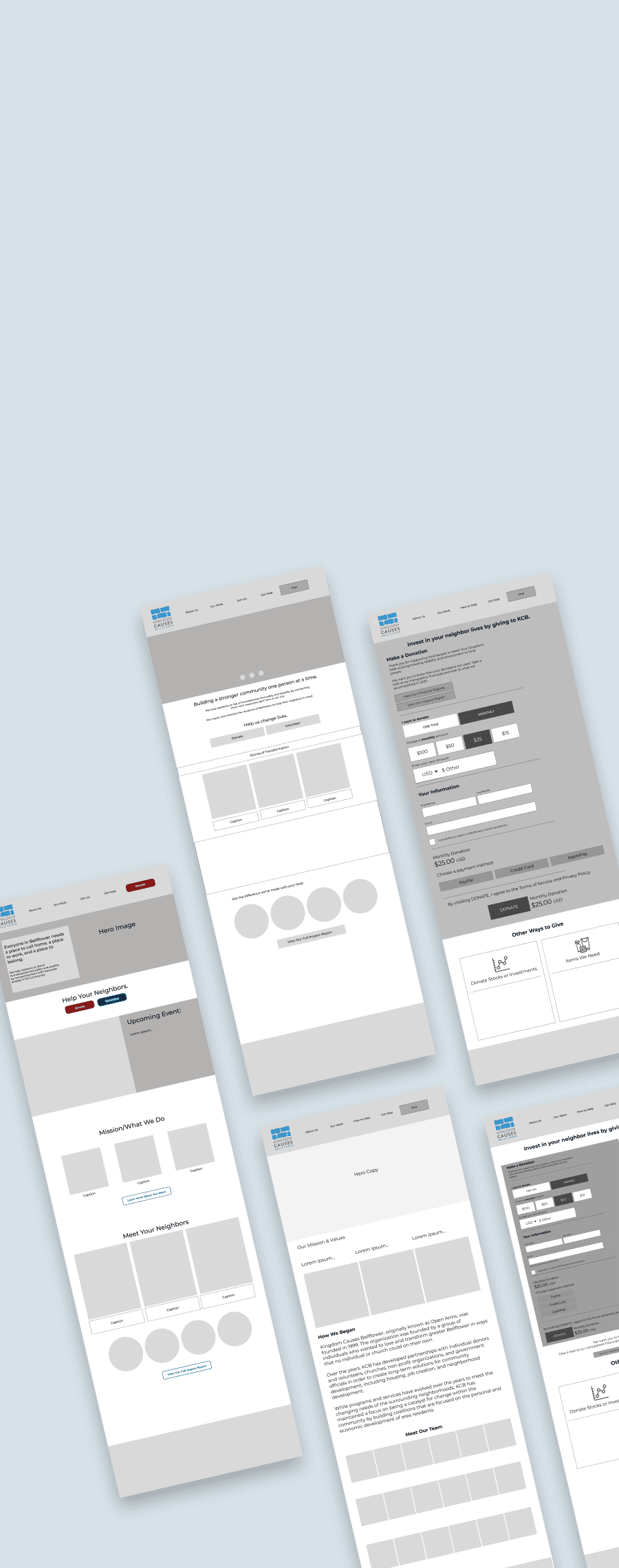
I began laying out KCB’s website in wireframes, exploring multiple solutions for the home page and donation page in particular.


Originally I planned for an “upcoming events” banner to be prominent on the home page because events drive a large part of KCB’s fundraising.


However, they chose not to keep this feature because they only publicize a few events each year.

Wireframes & iterations

Wireframes & iterations

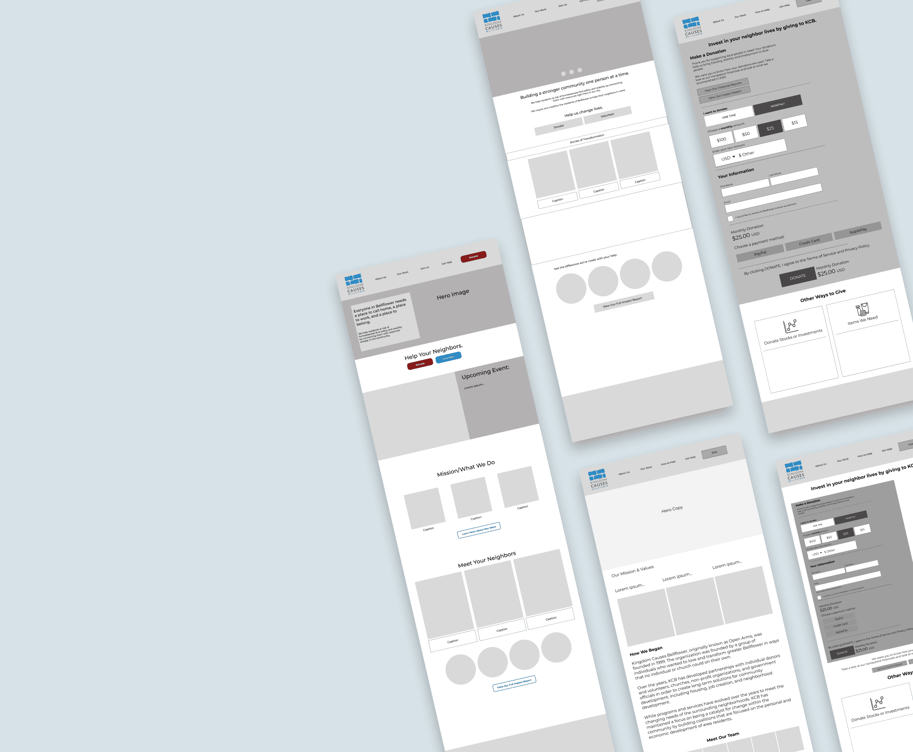
I began laying out KCB’s website in wireframes, exploring multiple solutions for the home page and donation page in particular.


Originally I planned for an “upcoming events” banner to be prominent on the home page because events drive a large part of KCB’s fundraising.


However, they chose not to keep this feature because they only publicize a few events each year.

#C05300

#045491

#91C70B5

#F8F5EF

#E5E3DF

#4D4C4A

Give Now

Give Now

Raleway

Aa

Headings, actions

Bold

Nobile

Aa

Body

Regular

About Us

About Us

Active:

Completed:

Unsuccessful/Wrong:

Normal:

Disabled:

The text entered is not a valid email address.

Checkbox

ONE TIME

MONTHLY

$100

$50

$25

$15

Colors

Typography

Form Fields

Top Navigation Bar

Blog card

Hover tiles

Email sign-up

Buttons

Primary Button

Primary Button

About Us

Our Work

Get Involved

Get Help

Contact

Give Now

Give Monthly


Your regular contributions make our work possible.

Get Updates & Inspiration in Your Inbox

Your Email:

Subscribe to KCB’s Newsletter

Get Updates & Inspiration in Your Inbox

Thank you for subscribing to our newsletter! We’ll send you stories from your neighbors and keep you informed about our events.

Arcelia: Interning at KCB

Each year, KCB is lucky to work with passionate interns who are seeking to make an impact...

Read Story

Design system

To aid KCB in building their website and adding to it in the future, I documented a small design system of components, colors, and typography for them.

Accessibility

A prevalent problem on KCB’s website was poor contrast between text and background.


This was especially concerning given that most of their donors are over age 50.


It was important to stakeholders that I include the gray and blue colors from their logo.


However, neither of these colors provided an acceptable ratio of contrast and saturation when used with text.


I solved this issue by finding the lightest shade of gray that would pass contrast checks, and implementing the blue color in non-textual elements (icons).


I also specified font sizes for headings, body, and actions that would be clearly visible on both desktop and mobile.

Results & prototype

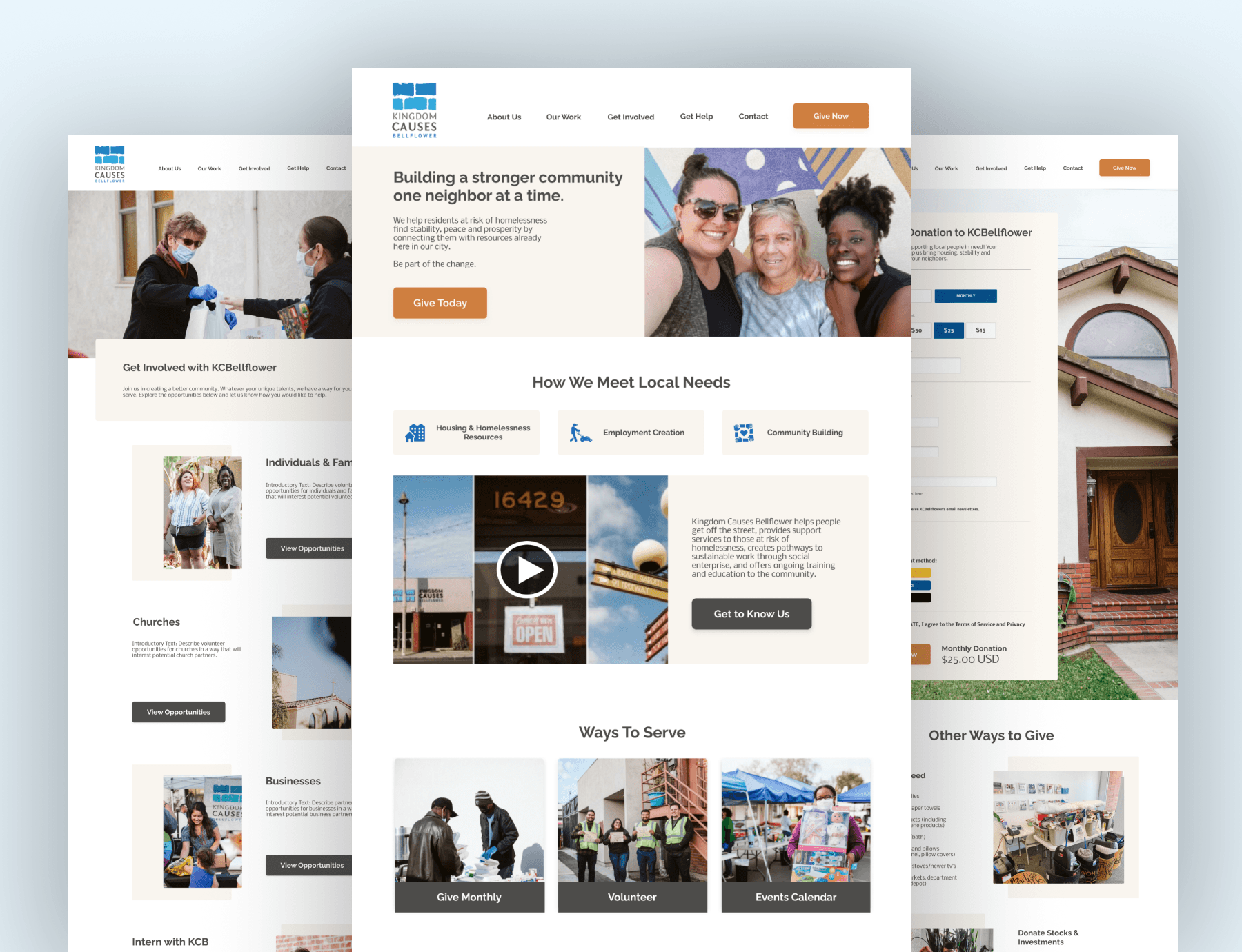
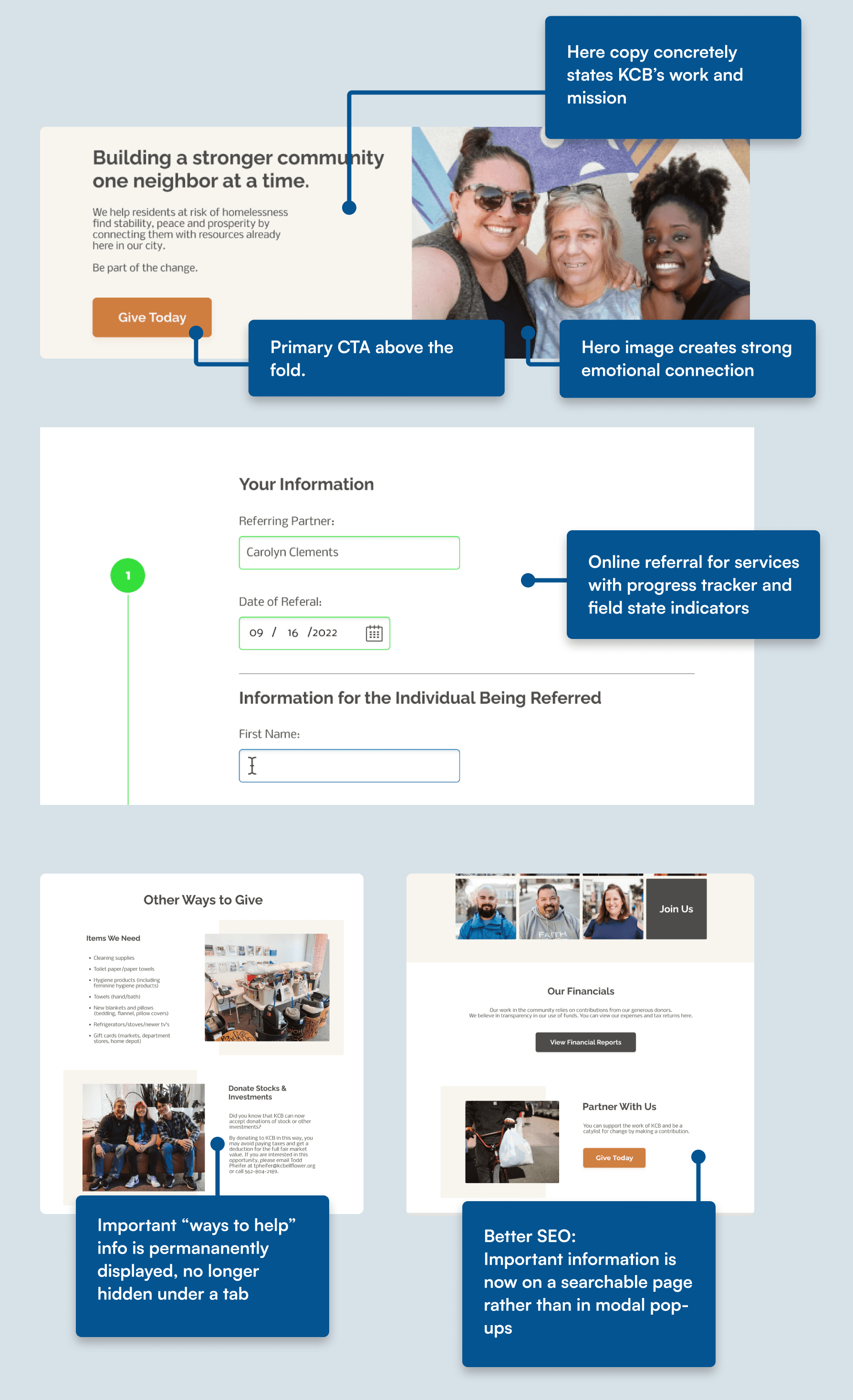
Here copy concretely states KCB’s work and mission

Hero image creates strong emotional connection

Primary CTA above the fold.

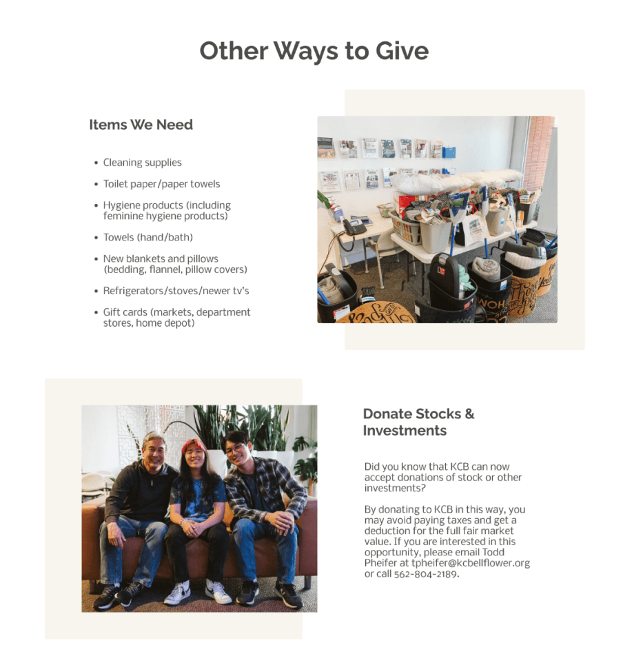
Important “ways to help” info is permananently displayed, no longer hidden under a tab

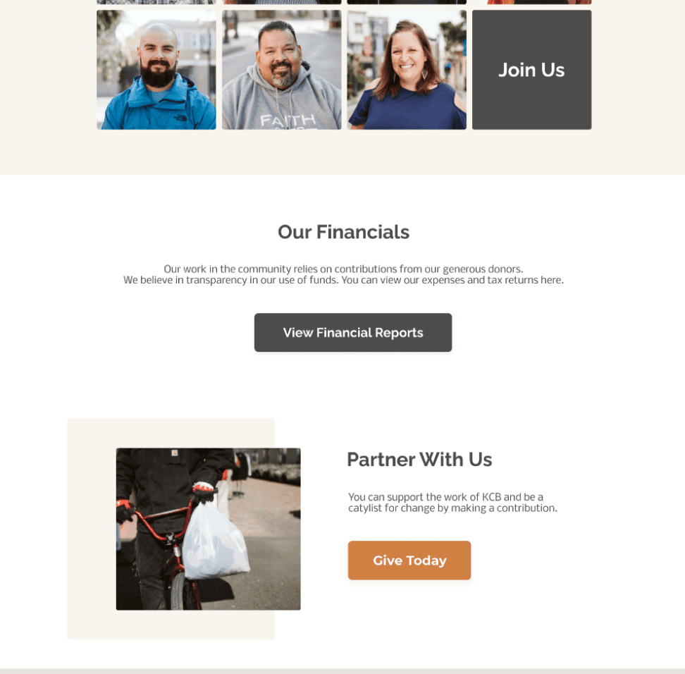
Kingdom Causes Bellflower now has a website content plan that will address key questions, accurately describe their mission, and allow users to donate or refer beneficiaries entirely on their website.


Link to prototype

Kingdom Causes Bellflower now has a website content plan that will address key questions, accurately describe their mission, and allow users to donate or refer beneficiaries entirely on their website.


Link to prototype

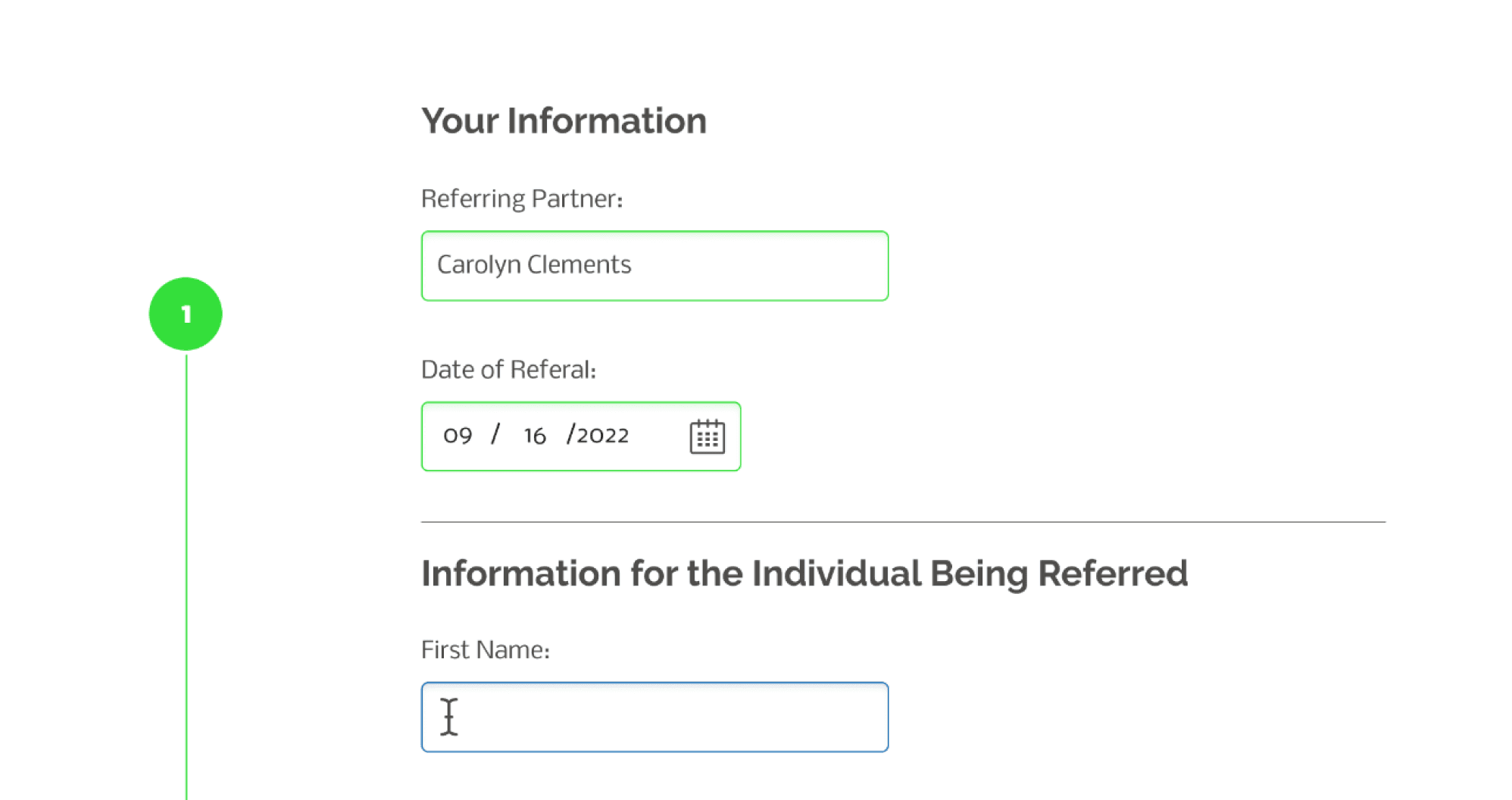
Online referral for services with progress tracker and field state indicators

Better SEO:
Important information is now on a searchable page rather than in modal pop-ups

Carolyn was great to work with. She made sure to understand our organization’s goals and target audience by asking us insightful questions before she began creating our website content plan. The result was a clear, clean, and concise website content plan along with notes that we look forward to referencing as we build our new website.

-Caitlin G, KCBellflower